How to Create Appealing Interiors That Feel Like You
How to Create Appealing Interiors That Feel Like You
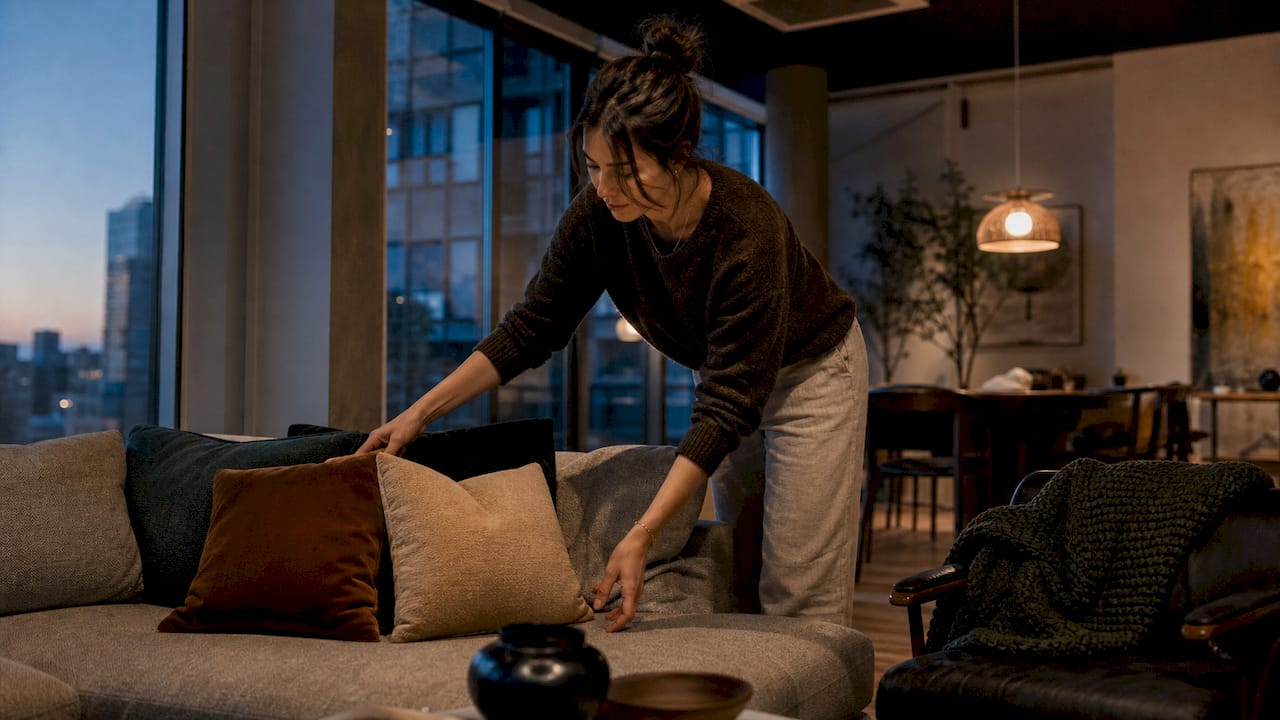
TL;DR:
- Creating appealing interiors involves balancing sensory engagement, strategic color use, layered lighting, and thoughtful editing. Focusing on all five senses and following the 60-30-10 color rule ensures visual harmony, while layered lighting enhances both function and ambiance. Personal authenticity is achieved by building texture first, editing intentionally, and designing cohesively room by room.
Appealing interiors are defined by the deliberate combination of sensory engagement, functional layout, harmonious color, and curated personal style. Professional interior designers call this approach “experiential design,” and it goes far beyond picking paint colors or buying new furniture. The principles behind creating stylish interiors draw on color theory, lighting science, and the psychology of space. This article covers the core methods: the 60-30-10 color rule, layered lighting from the Interior Design Institute, sensory design strategies, and personalization advice from Real Simple and Architectural Digest. Follow these steps and your space will feel intentional, not accidental.
How to create appealing interiors through sensory engagement
Most people design for sight alone. Experiential interior design works across all five senses, and the difference in how a room feels is immediate and measurable. When you design for all senses, sound, smell, and touch become tools just as powerful as color and light.
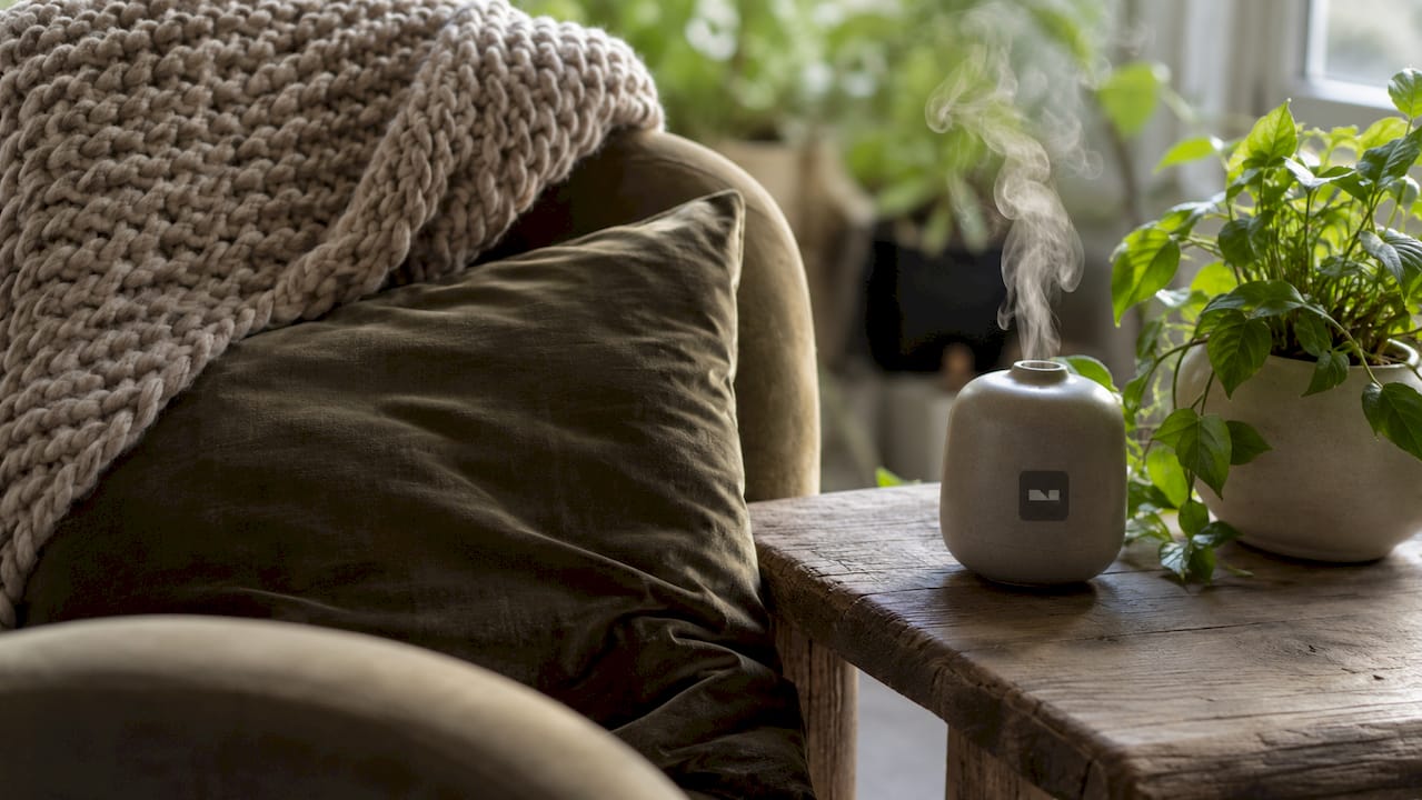
Sight is still the starting point. Color palettes, natural light, form, and texture all register visually before anything else. A room with varied textures, a clear focal point, and balanced proportions reads as polished even before you add a single decorative object.
Sound shapes comfort in ways most homeowners overlook. Hard surfaces like concrete floors and bare walls reflect sound and create echo. Rugs, upholstered furniture, bookshelves, and curtains absorb sound and make a room feel warmer and more settled. In open-plan apartments, a large area rug under a seating group does double duty: it defines the zone visually and softens the acoustic environment.
Smell is the most memory-linked sense. Scent anchors mood and triggers emotional associations faster than any visual cue. Candles, diffusers, fresh flowers, or even a bowl of citrus on the kitchen counter give a room a signature that guests remember. Choose one consistent scent per room rather than layering competing fragrances.
Touch adds depth that photographs cannot capture. Layering a linen sofa with a chunky wool throw and a velvet cushion creates tactile contrast that makes the space feel rich without adding visual clutter. Stone countertops, woven baskets, and smooth ceramics each contribute a different surface quality that rewards physical interaction.
Taste applies most directly to dining and kitchen spaces. A well-designed dining area with proper lighting, comfortable seating, and a table set with intention signals hospitality and makes meals feel like events rather than routines.
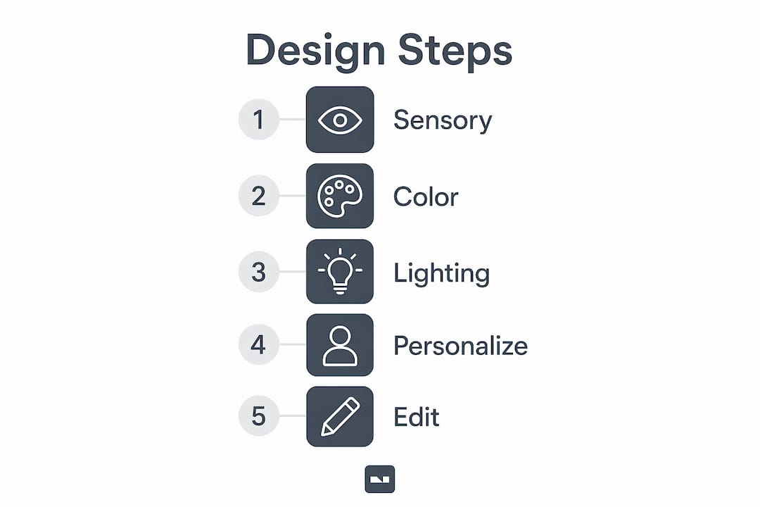
Pro Tip: Layer at least three different textures in any seating area before you add color. Texture creates perceived depth that color alone cannot achieve.
What color strategies help create visually balanced rooms?
Color is the single most discussed element in interior design, and also the most misunderstood. The 60-30-10 color rule is the clearest framework for getting it right. It assigns 60% of a room’s color to a dominant tone, 30% to a secondary complementary color, and 10% to an accent. This ratio mirrors how the eye naturally scans a space and creates balance without monotony.
The dominant 60% typically covers walls and large furniture pieces like sofas or bed frames. Neutrals work well here because they give the eye a place to rest. Warm whites, soft greiges, and muted sage greens are reliable choices that age well and adapt to changing accents.
The secondary 30% covers window treatments, cabinetry, and mid-size furniture. This is where you introduce a complementary tone that adds interest without competing with the dominant color. A room with warm white walls might use a dusty blue for curtains and an upholstered chair to create a calm, layered effect.
The accent 10% is where personality lives. Throw pillows, artwork, vases, and statement light fixtures carry the accent color. Because only 10% of the room uses this tone, you can afford to go bold. Deep terracotta, forest green, or brass all work as accents in rooms where they would overwhelm as a dominant color.
For palette selection, the color wheel provides two clear strategies. High-contrast palettes use colors from opposite sides of the wheel, such as navy and burnt orange, for drama and energy. Subtle palettes draw from adjacent colors, like sage green and soft teal, for a calm and cohesive result. Your architectural elements, including flooring, trim, and fixed cabinetry, should inform which direction you go. A room with warm oak floors and white trim calls for a warm palette; cool gray concrete floors support cooler tones.
| Palette type | Dominant (60%) | Secondary (30%) | Accent (10%) | Best for |
|---|---|---|---|---|
| Warm neutral | Warm white | Camel or tan | Terracotta | Living rooms, bedrooms |
| Cool calm | Soft gray | Dusty blue | Sage green | Bathrooms, home offices |
| Bold contrast | Navy | Crisp white | Brass or gold | Dining rooms, studies |
| Earthy organic | Warm beige | Olive green | Rust or clay | Open-plan living areas |
Pro Tip: Test paint colors in at least a 12-by-12-inch swatch on your actual wall and observe it at three different times of day before committing. Artificial light shifts color temperature dramatically.
For small spaces specifically, the color palettes for small rooms guide from Vibemyflat covers how to use light-reflective tones and strategic contrast to make compact areas feel larger and more considered.
How to plan and layer lighting for style and function
Lighting is the element that separates a professionally designed room from a well-furnished one. Layered lighting divides interior illumination into four distinct types: ambient, task, accent, and decorative. Each serves a different purpose, and a room that relies on only one type will always feel flat or uncomfortable.
Ambient lighting is the base layer. It provides general visibility and sets the overall brightness of the room. Recessed ceiling lights, flush-mount fixtures, and large pendants typically handle ambient light. The Interior Design Institute notes that ambient light must come first to avoid cave-like spaces before other layers are added.
Task lighting focuses on activity areas. Under-cabinet lights in a kitchen, a reading lamp beside a chair, and a desk lamp in a home office are all task lights. They reduce eye strain and make functional spaces genuinely usable rather than just visually appealing.
Accent lighting creates depth and draws the eye to specific features. Picture lights over artwork, LED strip lights inside shelving, and directional spotlights on architectural details all fall into this category. Accent lights are what give a room visual hierarchy and make it feel considered rather than generic.
Decorative lighting adds aesthetic impact. A sculptural pendant, a cluster of exposed Edison bulbs, or a statement floor lamp functions as a design object in its own right, contributing to the room’s character even when switched off.
| Lighting type | Primary purpose | Common fixtures | Best placement |
|---|---|---|---|
| Ambient | General visibility | Recessed lights, flush mounts | Ceiling, evenly distributed |
| Task | Activity support | Desk lamps, under-cabinet strips | Work surfaces, reading areas |
| Accent | Depth and focus | Spotlights, picture lights | Artwork, shelving, features |
| Decorative | Aesthetic impact | Statement pendants, floor lamps | Focal points, corners |
The most common mistake in home lighting is relying on a single overhead fixture for an entire room. This creates harsh shadows and eliminates depth. Dimmers are one of the highest-return investments in any room: they cost little and allow you to shift the mood from bright and functional to warm and atmospheric without changing a single fixture.
Pro Tip: Install dimmers on every ambient circuit in your home. The ability to drop ambient light to 30% and let accent and decorative layers take over transforms how a room feels in the evening.
For a deeper breakdown of residential lighting strategies, the home lighting guide from Vibemyflat covers layering techniques room by room.
How to personalize your interiors for lasting appeal
Trends cycle every three to five years. Personal style, when identified and applied deliberately, does not. Recurring design preferences are the foundation of lasting style. Look at the spaces you have photographed, saved, or returned to repeatedly. The common threads, whether that is natural materials, bold pattern, or restrained minimalism, are your actual aesthetic, not the one you think you should have.
Interior design experts consistently prioritize function and flow before finishes and decor. Before you buy a single cushion, map how you move through the room, where you sit, where you need storage, and where natural light falls. A beautiful room that forces awkward traffic patterns or lacks adequate storage will always feel frustrating to live in.
Styling should build texture and depth before color is applied. This means selecting your materials first: wood, stone, linen, ceramic, metal. Once those are in place, the color palette often suggests itself based on the tones already present in the materials.
Editing is as important as adding. A curated look depends more on what you remove than what you add. Every object in a room should earn its place by being beautiful, useful, or personally meaningful. Objects that are none of these three things create visual noise that undermines even the best color and lighting choices.
When grouping decorative objects, the rule of odd numbers applies consistently. Groups of three or five read as more dynamic and natural than pairs or even-numbered arrangements. Vary the height, scale, and material within each group for visual interest without chaos.
Common styling mistakes to avoid:
- Buying furniture before measuring the room and mapping traffic flow
- Hanging artwork too high (eye level is the standard, not ceiling height)
- Using only one size of cushion on a sofa
- Matching everything in a room to the same wood tone or metal finish
- Ignoring the ceiling as a design surface
- Rushing to fill every surface before the base layers are settled
A room-by-room design approach works best when each space shares base design decisions, like a consistent palette and material language, while expressing personality through individual accents. This is what makes a home feel cohesive rather than like a series of unrelated showrooms.
Key takeaways
Creating appealing interiors requires sensory awareness, a structured color approach, layered lighting, and editing for personal authenticity rather than trend-chasing.
| Point | Details |
|---|---|
| Use the 60-30-10 rule | Assign 60% dominant, 30% secondary, and 10% accent color for visual balance in every room. |
| Layer all four lighting types | Ambient, task, accent, and decorative lighting together prevent flat, uncomfortable spaces. |
| Design for all five senses | Sound, smell, and touch shape how a room feels as much as color and light do. |
| Edit before you add | Remove objects that are not beautiful, useful, or meaningful to achieve a curated look. |
| Build texture before color | Select materials and surfaces first; let their tones guide your color palette choices. |
What I’ve learned from designing spaces that actually work
Most interior design advice focuses on what to buy. The harder and more useful skill is knowing what to leave out. Every time I have walked into a room that felt genuinely right, the owner had made deliberate decisions about absence as much as presence. There was breathing room between objects, a clear focal point, and a lighting setup that shifted with the time of day.
The biggest mistake I see repeatedly is treating lighting as an afterthought. People spend weeks agonizing over paint colors and then install a single overhead fixture that washes out every decision they made. Lighting is not decoration. It is the medium through which every other design choice is perceived. Get it wrong and nothing else matters.
Color is the second most misapplied element. The 60-30-10 rule sounds simple, but most people invert it accidentally. They paint an accent wall in the dominant color, use a bold tone for 60% of the room, and wonder why the space feels aggressive. The rule works because it mirrors how the eye naturally wants to rest and then explore.
My honest advice: resist the urge to finish a room quickly. Live in it for a few weeks with only the furniture you need. Notice where the light falls, where you actually sit, and what the room asks for. The spaces that feel most personal and most appealing are almost always the ones that were built slowly, with each addition considered rather than rushed.
— Hello
See your interior ideas come to life with Vibemyflat
Knowing the principles is one thing. Seeing how they apply to your actual space is another.
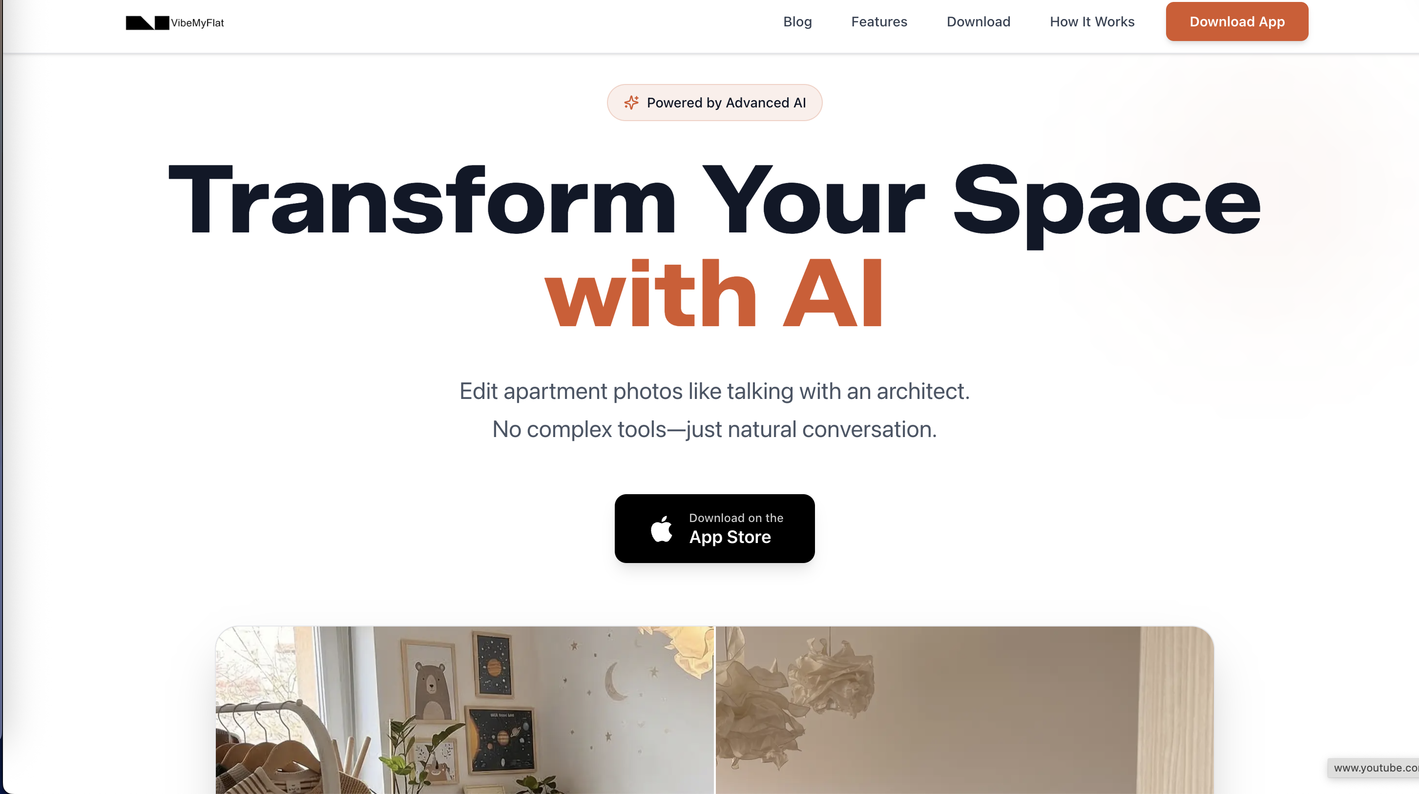
Vibemyflat is an AI-powered platform that lets you visualize interior changes in your own apartment photos in under 30 seconds. Describe what you want in plain language, whether that is a new wall color, a different lighting setup, or a complete room redesign, and Vibemyflat renders a professional-quality result instantly. No design software skills required. For homeowners and renters who want to test color palettes, lighting ideas, and styling choices before committing, try Vibemyflat and see your space transformed before you spend a dollar.
FAQ
What is the 60-30-10 rule in interior design?
The 60-30-10 rule assigns 60% of a room’s color to a dominant tone, 30% to a secondary complementary color, and 10% to an accent. It creates visual balance by mirroring how the eye naturally scans a space.
How many lighting layers does a room need?
A well-designed room uses four lighting layers: ambient for general visibility, task for activity areas, accent for depth and focal points, and decorative for aesthetic impact. Relying on a single overhead light produces flat, uncomfortable spaces.
How do you decorate a room to reflect personal style?
Identify your recurring design preferences by reviewing spaces you have consistently admired, then build around those patterns rather than current trends. Prioritize function and flow first, then layer materials and textures before applying color.
What are the best color schemes for small rooms?
Light-reflective neutrals in the dominant 60% position make small rooms feel larger, while a single bold accent color in the 10% position adds personality without overwhelming the space. Keeping the secondary 30% close in tone to the dominant color maintains cohesion.
Should you design one room at a time or plan the whole home first?
A room-by-room approach works best when each space shares a consistent base palette and material language. Individual rooms can then express distinct personalities through accent colors and decor without the home feeling disconnected.