What Is Mobile Design Visualization for Real Estate
What Is Mobile Design Visualization for Real Estate

TL;DR:
- Mobile design visualization involves deliberately adapting visual content for small touch screens to improve user experience and engagement. It emphasizes a mobile-first approach, simplified layouts, thumb-zone accessibility, and AI-assisted tools for faster, effective results. Proper mobile visualization enhances listings and proposals, leading to higher client inquiries and faster decision-making.
Mobile design visualization is the process of creating and adapting visual content specifically for small, touch-based screens, and 60% of dashboard consumption now happens on mobile devices as of 2025. For real estate agents, interior designers, and architects, this shift is not a trend to monitor. It is the current reality of how clients browse listings, review floor plans, and evaluate design proposals. The industry term most practitioners use is mobile-first visualization, which combines responsive layout principles with touch interaction design to produce content that performs on the device your audience actually holds. Tools like Vibemyflat, AI mockup generators, and platforms such as Figma have made this process faster and more accessible than ever before.
What is mobile design visualization and why does it matter?
Mobile design visualization is defined as the deliberate design and rendering of visual content, including property photos, interior layouts, and design mockups, so they display clearly and interact naturally on smartphones and tablets. The word “deliberate” carries weight here. This is not about making something smaller. It is about rethinking how information is structured, prioritized, and presented when the screen is 6 inches wide and the user is navigating with a thumb.

The practical stakes are high for real estate and interior design. A listing photo that looks stunning on a desktop monitor can appear cluttered and unreadable on a phone if the underlying design has not been adapted for mobile. Buyers scrolling through property apps on their commute will skip past listings that feel hard to read or interact with, regardless of how good the property actually is.
Understanding mobile visualization also means recognizing that mobile users behave differently from desktop users. They are often multitasking, in motion, and making faster judgments. Visual content must communicate its core message within seconds, which demands a level of visual clarity that desktop-first design rarely achieves by default.
What are the best practices for mobile design visualization?
The foundation of strong mobile user experience design is the mobile-first approach. This means designing for the smallest viewport first and then scaling up, rather than starting with a desktop layout and trying to compress it. Mobile-first responsive design reduces bounce rates and increases interaction times, which directly translates to more time spent on your listings or design presentations.
Several principles define best-in-class mobile interface visualization:
- Simplified UI elements. Every button, label, and image must earn its place. Removing visual noise is not laziness. It is precision. A property listing card on mobile should show the hero image, price, key specs, and one call-to-action. Nothing more.
- Thumb-zone accessibility. Placing interactive elements in the lower third of the screen, where thumbs naturally rest, reduces friction for one-handed use. Navigation menus, contact buttons, and booking links all belong in this zone.
- Modular, stacked layouts. Content should flow vertically in discrete blocks rather than across columns. Each block handles one idea: one photo, one data point, one action.
- Micro-animations for feedback. Motion design on mobile signals that a touch interaction has registered, a form has submitted, or a transition is in progress. These animations are functional, not decorative. They reduce user uncertainty and prevent repeated taps.
Pro Tip: Before finalizing any mobile design layout, test it with one hand on an actual device. If you cannot reach the primary action button with your thumb without shifting your grip, the layout needs adjustment.
How does mobile visualization differ from resizing desktop designs?
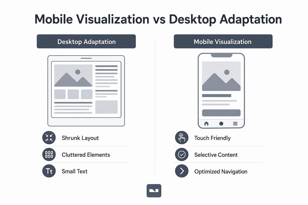
Shrinking a desktop design to fit a phone screen is the most common mistake in this field, and it produces predictably poor results. Downscaling desktop dashboards without redesign leads to illegible text, overlapping elements, and information that simply disappears from view. The user ends up pinching and zooming through a layout that was never meant for their screen.
Authentic mobile design visualization takes a fundamentally different approach. The table below shows the core distinctions:
| Feature | Desktop design adaptation | Native mobile visualization |
|---|---|---|
| Layout structure | Multi-column, horizontal flow | Single-column, vertical stacking |
| Navigation | Top menu bar with dropdowns | Bottom navigation bar, thumb-accessible |
| Image presentation | Wide-format hero banners | Full-width vertical cards |
| Typography | Smaller body text, dense paragraphs | Larger type, shorter line lengths |
| Interaction model | Hover states, cursor precision | Touch targets, swipe gestures |
| Information density | High, multiple data points visible | Low, progressive disclosure preferred |
A real estate listing redesigned for mobile does not just reformat the desktop page. It selects the three most persuasive photos, surfaces the price and location immediately, and places the contact agent button where a thumb lands naturally. The desktop version can carry more detail. The mobile version converts.
Pro Tip: When adapting an interior design presentation for mobile, convert multi-panel before-and-after comparisons into swipeable image cards. Swipe gestures feel native on mobile and keep the comparison format intact without requiring the user to zoom.
What tools and technologies support mobile visualization in real estate?
The tools available for mobile design visualization in 2026 have made the process significantly faster and more accessible to non-specialists. AI mockup generators represent the most significant shift. These tools generate mobile-ready layouts from natural language prompts in under 30 seconds, bypassing the manual wireframing process that once required dedicated UX designers.
For real estate agents and interior designers specifically, the most relevant tools fall into three categories:
- AI photo and space editors. Platforms like Vibemyflat allow users to describe changes to a room in plain language, such as “change the wall color to warm white and add pendant lighting,” and receive a photorealistic result instantly. This output is already optimized for mobile sharing and listing uploads, making it directly usable without additional formatting work. Vibemyflat’s mobile interior design tools are built for exactly this workflow.
- Prototyping platforms. Tools like Figma and Adobe XD allow designers and architects to build interactive mobile prototypes of floor plans or design concepts that clients can tap through on their phones before a single wall is painted.
- LLM-driven adaptation frameworks. User studies show LLM-driven adaptations achieve higher perceived usability than manual methods when converting desktop visualizations to mobile formats. These systems analyze layout hierarchy and automatically restack content for small screens.
The practical advantage for real estate professionals is speed and consistency. A listing that might have required a graphic designer to format for mobile can now be prepared by the agent directly, using AI tools that understand design principles without requiring the user to learn them. For architects presenting design concepts to clients, mobile-ready visualizations mean proposals can be reviewed and shared from any device, at any time.
How does mobile visualization improve user experience and business outcomes?
Strong mobile user experience design produces measurable results in real estate and interior design contexts. Enhanced visual clarity captures attention faster in competitive listing environments where buyers scroll through dozens of properties in minutes. A well-structured mobile layout communicates the property’s best features before the user has consciously decided to engage.
Intent-driven, modular design that adapts to user goals rather than presenting static information improves both productivity and satisfaction. For a buyer using a property app, this means seeing the information most relevant to their search criteria first, not a generic template. For a design client reviewing a renovation proposal, it means navigating between room concepts with a swipe rather than scrolling through a PDF.
The business case for investing in mobile visualization is direct. Listings with optimized mobile presentations hold attention longer, which increases the likelihood of an inquiry. Interior design proposals presented in mobile-friendly formats are easier for clients to share with partners or family members, which accelerates decision-making. Design leaders predict a shift from static, screen-filling interfaces to contextually prioritized visual cards, and real estate platforms that adopt this model early will have a clear advantage.
Micro-animations play a specific role in this outcome. UI animation provides fast feedback and improves microinteractions, particularly on mobile where there is no cursor to indicate hover states. A subtle animation confirming that a property has been saved to a favorites list, or that a contact form has been submitted, reduces user anxiety and builds trust in the platform.
Key takeaways
Mobile design visualization requires deliberate structure, touch-aware layouts, and AI-assisted tools to produce property and interior content that converts on the devices clients actually use.
| Point | Details |
|---|---|
| Definition is precise | Mobile design visualization means adapting content for touch screens, not simply resizing desktop layouts. |
| Mobile-first is the method | Design for the smallest screen first, then scale up to avoid layout failures on phones. |
| Thumb-zone placement matters | Place key action buttons in the lower third of the screen where thumbs rest naturally. |
| AI tools accelerate the process | Platforms like Vibemyflat generate mobile-ready visuals in under 30 seconds using plain language prompts. |
| Business outcomes are measurable | Mobile-optimized listings hold attention longer and shorten client decision-making cycles. |
Why I think most designers still underestimate mobile visualization
After working across real estate and interior design projects, the pattern I see most often is this: designers invest heavily in beautiful desktop presentations and treat mobile as an afterthought, a checkbox rather than a primary canvas. That instinct is understandable. Desktop screens give you space to show your craft. Mobile feels constraining.
The constraint is the point. A priority stack of three core interactions reduces redesign cycles and development friction, and the discipline of identifying those three interactions forces clarity that improves the desktop version too. When you cannot show everything, you have to decide what actually matters. That decision is the design work.
I have also seen AI tools misused as shortcuts that skip this thinking entirely. Generating a mobile mockup in 30 seconds is useful only if the underlying content hierarchy has been thought through. The AI handles the formatting. You still have to decide what the user needs to see first. Use tools like Vibemyflat’s AI visualization guide to speed up production, not to replace the thinking that makes a layout work.
Test on real devices, with real thumbs, before you call anything finished. The emulator in your browser is not the same as a phone in a client’s hand.
— Hello
See your spaces the way clients see them
Real estate agents and interior designers who present properties through mobile-optimized visuals close faster and get more inquiries. Vibemyflat makes this process direct: describe the change you want in plain language, and the AI produces a photorealistic result ready for mobile sharing in under 30 seconds.
Whether you are updating a listing photo, visualizing a renovation concept, or preparing a client presentation, Vibemyflat handles the technical formatting so you can focus on the design decisions that matter. The platform works on iOS, Android, and desktop, so your visuals look right on every screen your clients use. Start visualizing your spaces with Vibemyflat today and see the difference mobile-first presentation makes.
FAQ
What is mobile design visualization in simple terms?
Mobile design visualization is the process of creating and adapting visual content, such as property photos and interior layouts, specifically for small touch screens. It goes beyond resizing and involves restructuring layouts, navigation, and interactions for mobile users.
How does mobile-first design differ from responsive design?
Mobile-first design starts with the smallest screen and builds up, while responsive design often starts with desktop and scales down. Mobile-first produces better results for touch-based interfaces because constraints are addressed from the beginning rather than retrofitted.
Why do desktop designs fail on mobile without adaptation?
Downscaling desktop layouts causes illegible text, overlapping elements, and lost information. Mobile screens require modular, stacked layouts with large touch targets, not compressed versions of wide-format designs.
What tools help with mobile visualization for real estate?
AI platforms like Vibemyflat generate mobile-ready interior and property visuals from natural language descriptions in under 30 seconds. Prototyping tools like Figma allow architects and designers to build interactive mobile mockups clients can review on their phones.
How do micro-animations improve mobile design?
Micro-animations signal that a touch interaction has registered, reducing user uncertainty and preventing repeated taps. On mobile, where there are no hover states or cursor feedback, these animations are functional rather than decorative.