Creative Wall Color Examples to Transform Any Room
Creative Wall Color Examples to Transform Any Room

TL;DR:
- Creative wall color examples include techniques like gradient layering and color drenching, which transform rooms with depth and vibrancy. Proper testing, understanding undertones, and considering room function and lighting are essential for effective color choices. Visualizing colors before painting helps ensure deliberate decisions and satisfying results in home decor.
Creative wall color examples are innovative paint choices and techniques that visually enrich your home’s walls, making your space feel vibrant, personalized, and stylish. The best approaches go far beyond picking a single shade from a paint strip. Techniques like gradient layering, color drenching, and ombre blending, paired with brands like Sherwin-Williams and Benjamin Moore, give homeowners and renters a genuine toolkit for transforming any room. This article covers the most effective methods, color combinations, and practical tips so you can move from inspiration to a finished wall with confidence.
1. What is gradient layering and how does it add depth?
Gradient layering uses at least three tones from the same color family applied across architectural elements for a soft, cohesive effect. It is one of the most elegant creative wall color examples because it creates depth without stark contrast. The result feels collected and intentional rather than accidental.
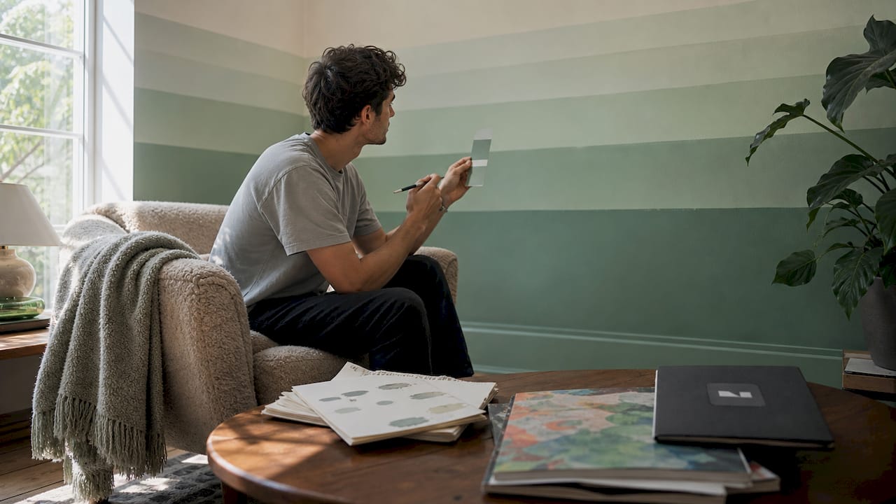
The technique works by spreading tones across every surface in the room, not just the main walls. Designers apply the lightest tone to the ceiling, a mid-tone to the walls, and the deepest shade to baseboards, trim, and crown molding. This highlights architectural details that a single flat color would flatten.
Color families that work especially well include:
- Soothing blues from sky to slate
- Warm browns from cream to walnut
- Soft greens from sage to deep olive
- Neutral taupes from warm white to charcoal
Gradient layering suits bedrooms, living rooms, and reading nooks where a calm, enveloping atmosphere is the goal. It also works in hallways where you want a sense of flow from one space to the next.
Pro Tip: Test all three tones on the same wall before committing. Paint large swatches side by side and check them at morning, midday, and evening light to confirm the tones read as a family rather than three unrelated colors.
2. How does color drenching create an immersive atmosphere?
Color drenching involves painting walls, ceiling, trim, and molding the same saturated hue for a maximalist, enveloping effect. It is the boldest entry in any list of vibrant wall paint examples. Studies, dining rooms, and home libraries respond especially well to this treatment.
The colors that perform best are pigment-rich and moody. Forest green, navy, terracotta, and deep plum hold their own across every surface in the room. Pale colors tend to wash out and lose their drama when repeated everywhere.
Warm undertoned colors like terracotta and warm whites are the most forgiving choices for first-time drenchings. They read as cozy rather than oppressive, even in rooms with limited natural light.
To prevent the look from feeling flat, layer in texture and contrast:
- Mix matte walls with a satin or eggshell finish on trim
- Add warm brass or aged bronze hardware and light fixtures
- Bring in natural materials like linen, rattan, or raw wood
- Use a single accent color in cushions or artwork to break the monochrome
| Color | Undertone | Best room |
|---|---|---|
| Forest green | Cool | Study, dining room |
| Terracotta | Warm | Living room, bedroom |
| Navy | Cool | Library, home office |
| Deep plum | Warm/cool | Dining room, powder room |
Pro Tip: Paint large swatches first and test finishes like eggshell for durability before committing to the full room. Dark colors create a calmer finished look when sampled properly.
3. What are the best multi-shade wall painting techniques?
Multi-shade techniques give homeowners the most hands-on creative room color schemes. Marbleizing, ombre blending, and feathering are the three most accessible methods for a DIY approach. Each creates visual texture that a flat coat of paint simply cannot replicate.
Here is a basic process for each technique:
- Marbleizing: Apply a base coat and let it dry fully. Dip a wool pad or sea sponge into a second color and dab it across the surface in irregular, overlapping strokes. Blend edges while the paint is still wet for a natural stone effect.
- Ombre blending: Divide the wall into three horizontal bands. Apply the darkest shade at the bottom, the mid-tone in the center, and the lightest at the top. Blend the boundaries between bands with a dry brush while the paint is wet.
- Feathering: Load a wide brush with two colors and stroke horizontally across the wall. Overlap the strokes and soften the lines immediately with a clean, dry brush. The result is a soft, atmospheric gradient.
- Geometric patterns: Use painter’s tape to mask off triangles, diamonds, or a checkerboard grid. Paint each section a different tone from the same color family, then remove the tape before the paint dries fully for crisp edges.
These techniques work best when the colors share an undertone. Mixing a warm beige with a cool gray in an ombre, for example, creates a muddy midpoint rather than a clean blend.
- Choose colors within two to three shades of each other for ombre
- Use a level and chalk line for geometric patterns to keep angles true
- Practice feathering on a piece of cardboard before touching the wall
Pro Tip: For marbleizing, use a slightly damp wool pad rather than a soaking wet one. Too much moisture causes the paint to run and destroys the texture you are trying to build.
4. Which color combinations ensure a cohesive wall color scheme?
The most cohesive color combinations treat the ceiling, trim, and woodwork as part of the overall palette, not afterthoughts. Pairing complementary paint tones across woodwork and ceiling with the main wall color is what separates a decorated room from a painted one. A common example is extending a wall’s blue tone through the woodwork while choosing a warm off-white for the ceiling to add lift.
Undertones are the hidden variable that makes or breaks a color scheme. Undertones fall into warm and cool categories detectable by examining the darkest part of a paint strip. A gray with a purple undertone will clash with a beige that carries a yellow undertone, even if both look neutral on the chip.
Lighting changes how undertones read throughout the day. North-facing rooms pull cool undertones forward, making blues and grays feel colder. South-facing rooms warm everything up, which means a terracotta can read as orange by midday.
Practical steps for building a cohesive palette:
- Pull the wall color, trim color, and ceiling color from the same paint brand’s coordinated collection
- Test all three colors on the actual wall surface, not on white paper
- Check the combination under both natural daylight and your room’s artificial bulbs
- Confirm the trim color reads as lighter or darker than the wall, not identical
| Surface | Role in the palette | Tip |
|---|---|---|
| Main wall | Dominant color | Choose this first |
| Ceiling | Lightest or complementary tone | Off-white adds height |
| Trim and woodwork | Anchor or accent tone | Match or contrast deliberately |
Pro Tip: The eight-inch rule recommends paint samples be at least 8x8 inches for accurate color judgment. Small chips misrepresent the final color because the eye reads large areas of color differently than tiny swatches.
5. How do lighting and room function shape the best paint color choice?
Jewel tones create dramatic moods, pastels reflect light and open small spaces, and moody colors like navy bring coziness. The right choice depends on what you want the room to do. A home office benefits from a focused, calm color like sage green. A dining room can handle a deeper, more theatrical shade like burgundy or forest green.
Paint finish matters as much as color. Matte finishes absorb light and hide wall imperfections, making them ideal for bedrooms and living rooms. Eggshell and satin finishes reflect more light and clean more easily, which suits kitchens, bathrooms, and kids’ rooms. Gloss finishes are best reserved for trim and doors where you want a sharp, defined edge.
Room size changes the rules. Small rooms benefit from color palettes for small spaces that use light, airy tones or monochromatic schemes to push walls back visually. Large rooms can absorb deeper, richer colors without feeling closed in.
Renters face extra constraints but still have options. Removable wallpaper panels, large-scale art, and temporary peel-and-stick paint samples let you test inspiring wall color palettes without touching the actual walls. For rooms where painting is allowed, a single accent wall in a bold color delivers impact with minimal commitment.
- East-facing rooms get warm morning light, which suits cool blues and greens
- West-facing rooms glow orange in the afternoon, which amplifies warm tones
- Artificial lighting with warm bulbs (2700K) deepens warm colors and dulls cool ones
- LED daylight bulbs (5000K) reveal true undertones most accurately
Key takeaways
The most effective creative wall color examples combine the right technique, a deliberate color palette, and an understanding of how light changes color throughout the day.
| Point | Details |
|---|---|
| Gradient layering adds depth | Use at least three tones from one color family across walls, trim, and ceiling. |
| Color drenching needs pigment | Choose deep, saturated hues and add texture to prevent a flat result. |
| Test at scale | Follow the eight-inch rule and check swatches in both natural and artificial light. |
| Match undertones first | Confirm warm and cool undertones align across all surfaces before buying paint. |
| Finish affects function | Choose matte for bedrooms, eggshell for high-traffic areas, and gloss for trim. |
Why I think most people get wall color wrong before they even open a can
The single biggest mistake I see is treating paint selection as a solo decision made at the store. People pick a color under fluorescent lighting, take home a tiny chip, hold it against a white wall for ten seconds, and commit to five gallons. That process almost guarantees a surprise.
Lighting conditions must be treated as part of the color choice process because paint undertones shift under different natural and artificial lights throughout the day. A color that reads as a clean warm white at noon can turn distinctly pink by 6 p.m. under incandescent bulbs. I have seen this derail entire renovation budgets.
The second mistake is ignoring the room’s architecture. Color drenching a room with beautiful original molding is a gift. The same technique in a box-shaped rental with no architectural detail just looks like a very dark room. The technique has to match the bones of the space.
My honest advice is to spend more time on the wall color inspiration phase than feels necessary. Look at the room at every hour of the day. Paint large test patches. Live with them for a week. The extra time costs nothing and saves you from repainting.
Bold color choices are worth making. A room painted in a single confident color, executed well, is always more memorable than a room painted in a safe beige that nobody notices. The goal is not to be cautious. The goal is to be deliberate.
— Hello
See your wall color ideas before you paint a single stroke
Choosing a wall color is much easier when you can see it in your actual room before committing. Vibemyflat lets you describe the change you want in plain language and generates a realistic photo of your space with the new color applied in under 30 seconds.

Whether you are testing a deep forest green for color drenching or comparing three gradient tones for a layered bedroom, Vibemyflat gives you a clear visual before you buy a single can of paint. The platform works on both iOS and Android, so you can test ideas directly from your phone. Visit Vibemyflat to visualize your next wall color project and make your decision with confidence.
FAQ
What is the easiest creative wall painting technique for beginners?
Ombre blending is the most accessible technique for beginners. Divide the wall into three horizontal bands and blend the color boundaries while the paint is still wet.
How do I choose between color drenching and gradient layering?
Color drenching uses one saturated hue on every surface for a dramatic, maximalist effect. Gradient layering uses multiple tones from one color family for a softer, more subtle result.
How big should paint test swatches be?
The eight-inch rule recommends swatches of at least 8x8 inches. Small chips misrepresent the final color because large areas of color read differently than tiny samples.
What paint finish works best for living rooms?
Eggshell or matte finishes work best for living rooms. Matte hides imperfections and absorbs light, while eggshell adds a slight sheen and cleans more easily.
Can renters use creative wall color techniques?
Renters can use removable wallpaper panels, peel-and-stick paint samples, and large-scale art to test color ideas. Where painting is permitted, a single accent wall delivers strong visual impact with minimal commitment.