The Role of Color in Apartment Styling: 2026 Guide
The Role of Color in Apartment Styling: 2026 Guide

TL;DR:
- Color is the most powerful tool for shaping how an apartment feels and functions.
- Using color psychology, you can influence mood, energy, and perception of space effectively.
Color is the single most powerful tool in apartment styling, directly shaping how a space feels, how large it appears, and how you experience it every day. The role of color in apartment styling goes far beyond aesthetics. It affects your mood, your energy levels, and even your perception of temperature. Interior designers call this applied color psychology, and it is the foundation of every well-styled apartment. Whether you own your space or rent it, understanding how color works gives you a real advantage in creating a home that feels intentional and alive.
How does color psychology influence mood in apartments?
Color psychology is the study of how specific hues affect human emotion and behavior in built environments. In apartments, where square footage is limited and every surface counts, these effects are amplified. The wrong color choice does not just look off. It can make you feel restless, cramped, or drained without you ever knowing why.
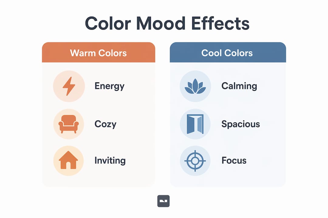
Warm colors and cool colors work on the nervous system in opposite ways:
- Warm tones (reds, oranges, yellows): cool tones soothe while warm tones stimulate heart rate and energy. Use warm tones in dining areas or living rooms where social energy is welcome.
- Cool tones (blues, greens, soft teals): promote calm and focus. Bedrooms and home offices benefit most from these hues.
- Neutral palettes (warm grays, greiges, soft beiges): reduce sensory overload and create a backdrop that lets furniture and art do the work.
- Saturated brights: bright colors cause sensory overload over time. Sustained comfort comes from carefully selected subdued tones, not high-voltage hues.
One surprising finding: rooms painted in warm reds or oranges are perceived 3–4°C warmer despite no actual temperature change. That means color can make a cold north-facing apartment feel cozy without touching the thermostat.
Pro Tip: Use red as an accent color rather than a full wall treatment. Red as a full wall can overwhelm a room quickly, but a red throw, rug, or piece of artwork adds warmth and energy without dominating the space.
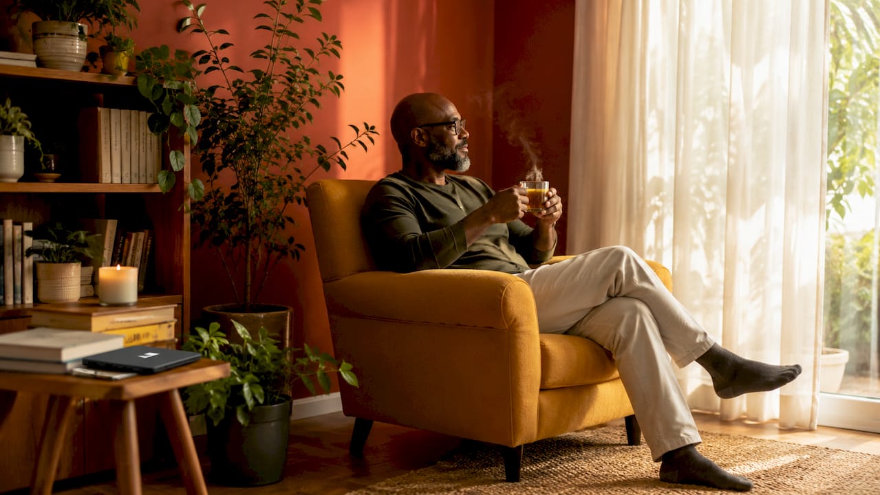
For a deeper look at how specific hues translate into real apartment interiors, the wall color ideas for 2026 guide on Vibemyflat covers current palettes with psychological grounding.
What color schemes work best for small apartments?
Choosing colors for a small apartment requires a different logic than decorating a large home. The goal is to use color to create the perception of space, not just to express style. Two technical concepts matter here: Light Reflectance Value (LRV) and tonal contrast.
LRV measures how much light a paint color reflects on a scale of 0 (black) to 100 (pure white). In apartments under 800 sq ft, an LRV between 55–75 ensures openness without harsh glare. This range covers soft whites, warm creams, and muted pastels. These shades reflect ambient light and visually push walls and ceilings back, making the room feel larger than it is.
Light vs. dark: when each approach works
| Approach | Best for | Effect |
|---|---|---|
| Light walls (LRV 55–75) | Studios, small bedrooms | Expands perceived space, reflects light |
| Monochromatic tonal scheme | Open-plan layouts | Reduces contrast, creates visual flow |
| Dark accent wall | Living rooms, alcoves | Adds depth and drama without shrinking the whole room |
| Gradient (lighter near windows) | Any room with natural light | Mimics natural light, adds subtle volume |
The gradient technique is worth understanding in detail. Walls painted 10–15% lighter near windows create an illusion of more volume by mimicking natural light behavior. You paint the wall closest to the window in a slightly lighter shade of the same color family. The result reads as depth and dimension rather than a flat surface.
Dark accent walls deserve more credit than they typically get in small-space advice. A single deep navy, forest green, or charcoal wall acts as a visual anchor. It adds contrast and depth without shrinking the room, as long as it does not dominate more than one surface. The top color palettes for small spaces resource on Vibemyflat shows exactly how this works in real apartment layouts.
Pro Tip: Match your ceiling paint to your wall color but go 1–2 shades lighter. Ceilings painted this way erase visual boundaries and increase perceived height without any structural change.
How can renters style with color without painting?
Renters face a real constraint: most leases prohibit painting. The common mistake is treating this as a dead end. Bold rugs and artwork can add vital color impact legally and affordably, and the effect on a room’s atmosphere is significant.
Here are the most effective renter-friendly color strategies:
- Large area rugs: A rug in a deep teal, terracotta, or mustard yellow anchors the room and introduces the dominant color of your palette without touching a wall.
- Throw pillows and blankets: Layer two to three coordinating colors across a sofa. This is the fastest way to shift a room’s mood from neutral to warm or cool.
- Gallery walls and oversized art: A single large-format print with a strong color story does more for a room than ten small frames. Think of it as a painted wall you can take with you when you move.
- Curtains: Floor-to-ceiling curtains in a bold or rich color draw the eye upward and add height. They also frame the window as a design feature rather than a functional afterthought.
- Furniture with color: A velvet sofa in deep green or a painted bookcase in navy introduces color at a scale that rivals wall paint.
The principle behind all of these is layering small color pops to build a cohesive palette without committing to permanent changes. Start with one anchor piece in your chosen color, then add two or three supporting accents in complementary or tonal shades. The room will read as designed rather than assembled.
For more renter-friendly ideas, the practical interior enhancement tips on Vibemyflat cover accessories and decor solutions that work within lease restrictions.
How does lighting affect color choices in apartments?
Color does not exist independently of light. The same paint chip looks completely different under warm incandescent bulbs, cool LED lighting, and natural daylight. Ignoring this relationship is one of the most common and costly mistakes in apartment styling.
Here is a practical process for getting color and lighting right:
- Test paint samples on large squares (at least 12 x 12 inches) directly on the wall. Testing paint colors over several days helps you observe how they shift in morning light, afternoon sun, and evening artificial light before committing.
- Match your undertones to your light source. Warm-toned bulbs (2700K–3000K) make cool grays look purple or green. Cool LED lighting (4000K+) can make warm beiges look flat. Choose paint undertones that complement your fixed lighting, not fight it.
- Choose the right finish for each surface. Matte finishes absorb light and hide imperfections, making them ideal for walls. Eggshell and satin add a slight sheen that reflects light without creating glare. High-gloss finishes on trim and molding create crisp contrast and make architectural details pop.
- Use ceiling color strategically. A matte white or very light version of your wall color on the ceiling reduces glare and makes the room feel taller. A ceiling in the same color as the walls but 1–2 shades lighter erases the boundary between wall and ceiling, expanding the sense of volume.
- Highlight trim and molding with contrast. White or off-white trim against a colored wall creates definition and makes the room feel more structured. Painting trim the same color as walls in a slightly different finish creates a tonal, modern look.
Pro Tip: Check your apartment’s lighting and color interaction at three different times of day before finalizing any palette. What looks perfect at noon can feel completely wrong at 7 p.m.
Key Takeaways
Color is the most cost-effective tool for transforming apartment interiors, and using it with intention produces results that furniture and accessories alone cannot achieve.
| Point | Details |
|---|---|
| Color affects mood physically | Warm tones stimulate energy and raise perceived temperature; cool tones calm the nervous system. |
| LRV guides small-space choices | Aim for an LRV of 55–75 in apartments under 800 sq ft to balance brightness and avoid glare. |
| Renters have real options | Rugs, art, curtains, and furniture introduce color at scale without touching a wall. |
| Lighting changes everything | Test paint samples over several days under all lighting conditions before committing to a color. |
| Ceiling color expands space | Painting ceilings 1–2 shades lighter than walls erases visual boundaries and increases perceived height. |
What I’ve learned from watching people get color wrong
Most people approach apartment color by asking “What do I like?” That is the wrong starting question. The right question is “How do I want this room to feel at 9 p.m. on a Tuesday?” Aesthetics are personal, but the psychological effects of color are consistent. A bedroom painted in a saturated orange will make sleep harder regardless of how much you love the color.
The second mistake I see constantly is underestimating neutral walls. People treat beige or greige as a failure of imagination. In reality, a well-chosen warm neutral with the right LRV is one of the most sophisticated choices you can make. It lets light, texture, and furniture carry the room. The color is doing its job invisibly.
The third mistake is treating color as a single decision rather than a system. Your wall color, your ceiling, your trim, your rugs, your art, and your lighting all interact. When one element is off, the whole room feels unsettled and most people blame the furniture. I have seen apartments transformed entirely by changing one rug or swapping warm bulbs for cool ones, with no other changes at all.
My honest recommendation: start with your lighting conditions and your LRV target, then build your palette from there. Use the gradient technique in any room with natural light. Add one bold accent in a warm or cool tone depending on the mood you want. Then live with it for two weeks before adding more. Color rewards patience.
— Hello
See your apartment in a new color before you commit
Choosing the right color palette is much easier when you can see the result before you pick up a paintbrush or order a rug.
Vibemyflat is an AI-powered platform that lets you describe exactly the color change you want and see it applied to your apartment photo in under 30 seconds. Want to test a deep navy accent wall, a warm cream throughout, or a bold teal sofa against your current floors? Type it in and see it instantly. Vibemyflat understands design principles, not just filters, so the results look like a real redesign rather than a photo edit. Visit Vibemyflat to visualize your next color decision with confidence.
FAQ
What is the best color for a small apartment?
Soft whites, warm creams, and muted pastels with an LRV between 55–75 are the best colors for small apartments. They reflect light and visually expand the space without creating harsh glare.
How does color affect mood in an interior space?
Cool tones like blue and green calm the nervous system and support focus, while warm tones like red and orange stimulate energy and raise perceived temperature by up to 4°C. The effect is physiological, not just visual.
Can renters use color effectively without painting?
Yes. Large rugs, oversized artwork, bold curtains, and colored furniture all introduce color at a scale that rivals wall paint. These changes are renter-friendly and high-impact without violating lease terms.
What is Light Reflectance Value and why does it matter?
Light Reflectance Value (LRV) measures how much light a paint color reflects on a scale of 0 to 100. For apartments, an LRV of 55–75 balances brightness and openness without the harshness of pure white.
How do I test a paint color before committing?
Paint large sample squares directly on the wall and observe them over several days under morning light, afternoon sun, and evening artificial lighting. This process reveals how the color shifts across conditions and prevents costly mistakes.