What is color correction in interiors? A homeowner's guide
What is color correction in interiors? A homeowner's guide
TL;DR:
- Color correction in interiors involves adjusting white balance and lighting to accurately reflect material and surface appearances. Mixed lighting complicates this process, requiring separate adjustments for interior and window zones, often utilizing RAW files for flexibility. Proper workflow habits, including gray cards and anchor edits, ensure consistent, natural-looking results, while understanding undertones and lighting effects helps homeowners select and evaluate paint colors effectively.
Color correction is one of those terms that sounds simple until you actually try to do it. Most people assume it just means making colors look more appealing, brighter, or more saturated. But what is color correction in interiors, really? It’s the process of adjusting white balance, color tones, and lighting accuracy so that materials, surfaces, and spaces appear the way they actually look in person. For homeowners and property managers, getting this right has real consequences, from how a listing photo performs to whether that paint color you picked looks as good on your walls as it did on the chip.
Table of Contents
- Understanding color correction in interior spaces
- Challenges of mixed lighting and how to manage color zones
- Efficient workflows: Using gray cards and anchor edits for consistency
- Color correction beyond photos: Paint undertones and lighting effects in interiors
- Practical tips for homeowners and property managers: Achieving accurate colors in interiors
- The hidden complexity of interior color correction — and what most people miss
- Enhance your interiors with expert color correction services
- Frequently asked questions
Key Takeaways
| Point | Details |
|---|---|
| Purpose of color correction | Color correction restores natural and realistic colors by adjusting white balance and tones to match true interior lighting. |
| Manage mixed lighting | Treat interior and exterior/window areas as separate color zones with independent adjustments to avoid mismatched hues. |
| Use gray card workflow | Shooting a gray card per room anchors white balance accurately, improving consistency and saving editing time. |
| Lighting affects paint perception | Paint undertones look different depending on lighting temperature; testing colors under real conditions prevents mistakes. |
| Anchor edits per room | Setting one white balance correction per room and syncing saves effort and ensures uniform color across multiple photos. |
Understanding color correction in interior spaces
At its core, color correction in interiors means removing inaccurate color casts and restoring realistic tones. Every light source, whether a warm incandescent bulb, cool fluorescent tube, or afternoon sun streaming through a window, shifts how colors appear in a photograph and even to the naked eye. A white wall can photograph as yellow, orange, or blue depending entirely on the light source. Color correction adjusts colors, tones, and white balance to correct shifts caused by lighting and camera settings for natural and realistic results.
It’s important to separate color correction from color grading. Color grading is a creative choice, adding a warm film-style tone or a cool cinematic feel. Color correction comes first, and it restores accuracy. For homeowners and property managers, the goal is almost always correction, not grading. Buyers and renters need to trust that what they see in a photo is what they’ll find in the room.
Here’s what accurate interior color correction actually addresses:
- White balance errors that make neutral walls look yellow, orange, or blue
- Color casts from artificial lighting that distort the true color of flooring, cabinetry, or upholstery
- Inconsistencies between rooms that make a property feel disjointed in a photo gallery
- Overexposed windows that throw off the perceived color temperature of the entire room
Understanding interior photo editing basics helps homeowners recognize what actually needs fixing in their space before spending money on a professional or diving into software themselves.
Challenges of mixed lighting and how to manage color zones
Here’s the single biggest problem in interior color correction that almost nobody talks about upfront: most rooms have more than one type of light happening at once. You have warm, amber light from table lamps or recessed fixtures at 2700K. You also have cool, neutral daylight pouring in from windows at 5500K or higher. These two sources compete directly with each other, and no single white balance setting fixes both simultaneously.
Mixed lighting is a major challenge requiring treating interior and window areas as separate color zones with independent white balance before blending. This approach is called the Two-Zone Color Rule.
The practical method works like this:
- Zone 1 (interior): Set white balance to match the dominant artificial light, typically around 2800 to 3200K, so warm-lit surfaces look neutral and accurate
- Zone 2 (window/exterior): Set a separate, cooler white balance correction for the window area, which would otherwise blow out as blue or overly bright
- Blending the zones: Use masking or graduated filters in your editing software to merge the two adjusted zones without a visible seam at the transition
When one global white balance setting is forced across a mixed-light room, you’re always sacrificing one zone to fix another. The window looks blue, or the walls look orange. Neither is accurate.
Pro Tip: Shoot in RAW format whenever possible. RAW files let you apply separate white balance settings non-destructively, which makes the two-zone approach practical without any loss of quality.
For property managers with multiple units, learning seamless color matching techniques eliminates the inconsistent, patchwork look that makes listings feel unreliable.
Efficient workflows: Using gray cards and anchor edits for consistency
Once you understand the two-zone problem, the next challenge is doing this work efficiently across 20 or 30 photos from a property shoot. This is where gray cards and anchor edits earn their place.
A gray card is an 18% neutral gray reference card that you photograph in each room before shooting. Because it has no inherent color, your editing software can identify exactly what neutral looks like under that specific room’s light. Photographing an 18% gray card under each room’s dominant light and using it to anchor white balance saves significant post-production time and ensures consistent color across photos.
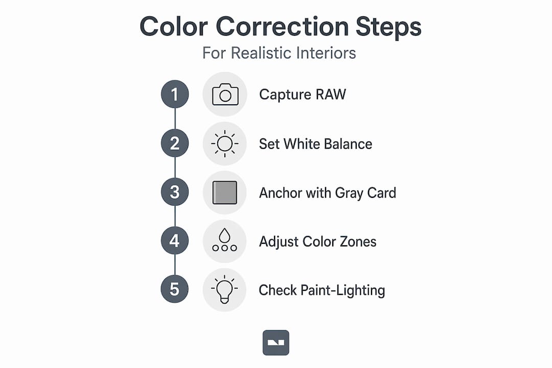
Here’s the Room Sequence Method, a four-step workflow that property professionals use:
- Group all photos by room before opening your editing software. Mixing rooms in the editing queue is the fastest way to introduce inconsistency.
- Identify the anchor photo for each room, usually the gray card shot or the clearest wide-angle establishing shot.
- Correct the anchor photo for white balance and color accuracy first, using the gray card reference or a neutral surface as your guide.
- Sync the correction from the anchor photo across all other photos in that same room, then make minor individual adjustments where lighting angles differ.
| Workflow step | Tool used | Time saved |
|---|---|---|
| Gray card white balance anchor | Gray card + editing software | 60 to 70% less manual adjustment |
| Room grouping before editing | Folder organization | Eliminates repeated re-corrections |
| Sync corrections across room batch | Lightroom sync or Capture One copy | Near-instant consistency across 10 to 20 photos |
| Final selective touch-ups | Masking or brush tools | Minimal compared to correcting each photo separately |
Pro Tip: If you forgot to shoot a gray card, look for a neutral white or light gray surface in the room, like a white appliance, baseboards, or a sheet of copy paper, and use the eyedropper tool in your editing software to set a manual white balance from that point.
A clear property photo editing workflow applied consistently is what separates a polished listing from one that looks like it was put together in an afternoon. If you’re short on time, a fast property edits guide can help you cut the process down without sacrificing accuracy.
Color correction beyond photos: Paint undertones and lighting effects in interiors
Color correction isn’t only a photography problem. It’s something you deal with every time you pick a paint color, and it catches a surprising number of homeowners completely off guard.
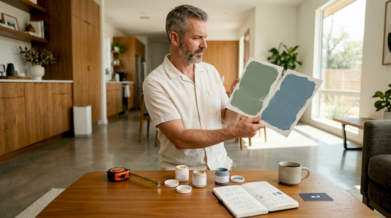
Every paint color has two components: the mass tone, which is the obvious dominant color you see on the chip, and undertones, which are secondary hues that only become visible in certain lighting conditions. A “greige” wall that looks warm and sandy under afternoon light might read as pink under cool LED bulbs, or greenish under certain fluorescent fixtures. This is not a defect in the paint. It’s how undertones work.
Lighting temperature affects how paint undertones reveal themselves, causing colors to appear differently under warm versus cool light bulbs. Here’s what that means practically:
- Warm bulbs (2700 to 3000K) amplify warm undertones in paint: reds, yellows, and oranges come forward, making spaces feel cozier
- Cool daylight bulbs (4000 to 5000K) pull out cool undertones: greens, blues, and purples become visible, which can clash with warm wood floors or brass fixtures
- Natural light changes throughout the day, meaning a paint color that works at noon can look completely different by late afternoon or under evening artificial light
| Bulb type | Color temperature | Undertone effect |
|---|---|---|
| Warm white LED | 2700 to 3000K | Emphasizes warm undertones; yellows and reds |
| Neutral white LED | 3500 to 4000K | Most balanced; closest to natural midday light |
| Cool daylight LED | 4000 to 5000K | Pulls out cool undertones; blues and greens |
| Natural sunlight (midday) | 5000 to 5500K | True rendering; reveals both undertones equally |
Pro Tip: Before committing to a paint color, buy a sample pot and paint two large swatches on different walls in the room. Live with them through a full day and into the evening with your actual bulbs turned on. The color that looks right at every hour is your answer.
Seeing how lighting adjustment tips apply to both real spaces and photos gives you a more complete picture of how light and color interact.
Practical tips for homeowners and property managers: Achieving accurate colors in interiors
Applying color correction principles in practice comes down to building consistent habits, both in how you shoot and how you evaluate spaces in person. Here’s what actually works:
- Set one white balance anchor per room and stick to it across all photos taken in that space. Inconsistent white balance across a photo gallery signals amateur work to buyers instantly.
- Use neutral surfaces as reference points when editing without a gray card. White trim, baseboards, or light appliances all serve as usable neutral targets.
- In mixed light rooms, prioritize the dominant light source for your global white balance, then use a graduated filter or mask to separately correct the window zone.
- Test paint colors under all your actual lighting conditions, including overhead lights at night, before finalizing a color choice.
Natural and realistic color representation builds buyer trust and enhances property appeal by accurately representing materials and lighting. That’s not a stylistic preference. It’s the standard buyers now expect from any serious listing.
Additional practical reminders:
- Shoot tethered or check your histogram to avoid exposing so far wrong that color correction becomes impossible
- Avoid mixing editing styles across a single property’s photo set, even if different rooms were shot on different days
- When in doubt, err toward cooler white balance in interiors. It’s easier to add warmth in post than to remove an orange cast without destroying skin or wood tones
Pro Tip: For property managers overseeing multiple units, create a preset library in your editing software with one preset per common lighting scenario (warm apartment overhead, mixed daylight/lamp, cool commercial LED). Apply the relevant preset as your starting point for each room to cut editing time significantly.
If you’re just getting started, a DIY interior photo editing guide will show you the exact tools and steps. If your listings need to be ready for the market quickly, professional photo editing removes the guesswork entirely.
The hidden complexity of interior color correction — and what most people miss
Here’s the honest truth: most beginner mistakes in interior color correction don’t come from not knowing what white balance is. They come from treating it as a single global problem when it’s actually a layered, zone-based one.
The failure mode we see repeatedly is this: a homeowner or first-time property manager shoots a beautiful living room, notices the photos look “off,” then adjusts exposure and brightness and calls it done. The room looks brighter. But the walls still have a subtle orange cast on one side and a cool blue cast near the window. That’s because correcting exposure without matching color temperatures per zone causes visible color seams despite proper brightness.
Exposure and color temperature are separate problems. Fixing one does not fix the other.
The same logic applies to paint choices. Homeowners spend weeks choosing the perfect gray, get it painted, and then are genuinely confused why it looks nothing like the swatch. They blame the paint company or the lighting, when the real answer is that they never tested the undertone under their specific bulbs and floor combination. The undertone interaction is entirely predictable once you know to look for it. Most people just never look.
The smarter approach, whether you’re editing photos or choosing a wall color, is to build from reference points outward. Set your anchor, whether that’s a gray card, a neutral surface, or a paint swatch tested across a full day of lighting conditions. Then correct everything else relative to that anchor. This is how professional color work actually gets done, and it’s a mental model that makes every future decision faster and more reliable.
For property managers handling multiple units, an AI photo editing workflow can apply consistent color corrections at scale without requiring manual zone-by-zone edits every single time.
Enhance your interiors with expert color correction services
Getting interior color right is harder than it looks, especially when mixed lighting, subtle undertones, and buyer expectations are all in play. If correcting every photo zone by zone or testing a dozen paint swatches sounds like too much, that’s exactly the gap VibeMyFlat was built to close.

VibeMyFlat uses AI to let you describe what you want in plain language — change the wall tone, adjust the lighting warmth, correct the color cast — and delivers professional-quality results in under 30 seconds. No complex software. No guesswork. Whether you’re prepping a listing, planning a renovation, or just trying to see what a different paint color would actually look like in your space, VibeMyFlat’s platform handles the color work so you don’t have to.
Frequently asked questions
What is the main goal of color correction in interior photos?
The main goal is to adjust colors and white balance so materials and lighting appear as they do in real life, removing misleading color casts caused by different light sources. Color correction adjusts colors to correct shifts caused by light sources and camera settings for natural and realistic results.
Why is mixed lighting a challenge for color correction in interiors?
Mixed lighting creates competing color temperatures across different areas of the same room, making a single white balance setting inaccurate for the whole frame. Mixed lighting requires treating interior and window areas as separate color zones with independent white balance.
How does lighting temperature affect paint color appearance in a room?
Warm bulbs pull out red and yellow undertones in paint, making colors feel cozier, while cool daylight bulbs reveal blue and green undertones that can clash with warm flooring or fixtures. Lighting temperature affects paint undertones, making colors appear different under warm versus cool bulbs.
What is the benefit of using a gray card when color correcting interior photos?
A gray card gives you a precise neutral reference under each room’s actual lighting, which you can sync across an entire batch of photos to keep color consistent throughout a property. Photographing an 18% gray card per room to anchor white balance saves post-production time and improves consistency.
Can I fix paint color mistakes by changing my lighting instead of repainting?
Yes. Switching from warm to cool bulbs, or the reverse, can dramatically shift how undertones appear, sometimes resolving a color mismatch without any repainting. Changing light bulbs can dramatically affect how undertones appear, sometimes avoiding the need to repaint.